Talking Keg
Real Time Beer Inventory Tracking
Node.js, Mongo DB, PHP

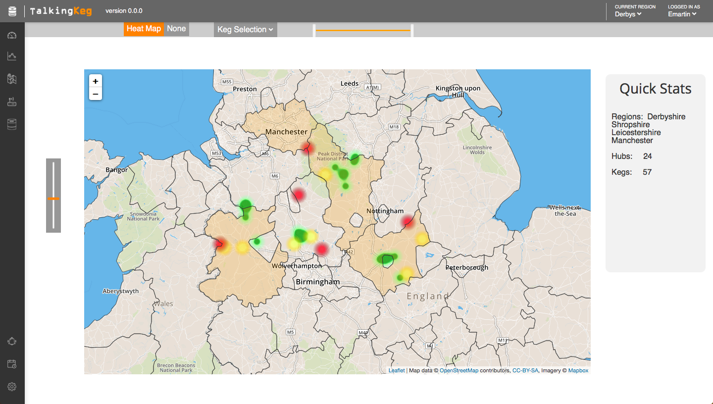
Talking Keg Heat Map
View Website
(password: drink-beer)
The Talking Keg dashboard is part of an inventory management system for beer distributors. A proprietary sensor is placed on a keg, which then communicates readings to the server. This dashboard allows the user to see past and present data, both for individual kegs and kegs in aggregate. This particular version was built for a distribution company based in the United Kingdom.
The biggest challenge for this project was the design. The sales team was intent on wanting something modern and intuitive. Honestly, I've never spent so much time thinking about things like row height, font size, and color! I'm happy with where we ended up; the site conveys the relevant information without getting in its own way.

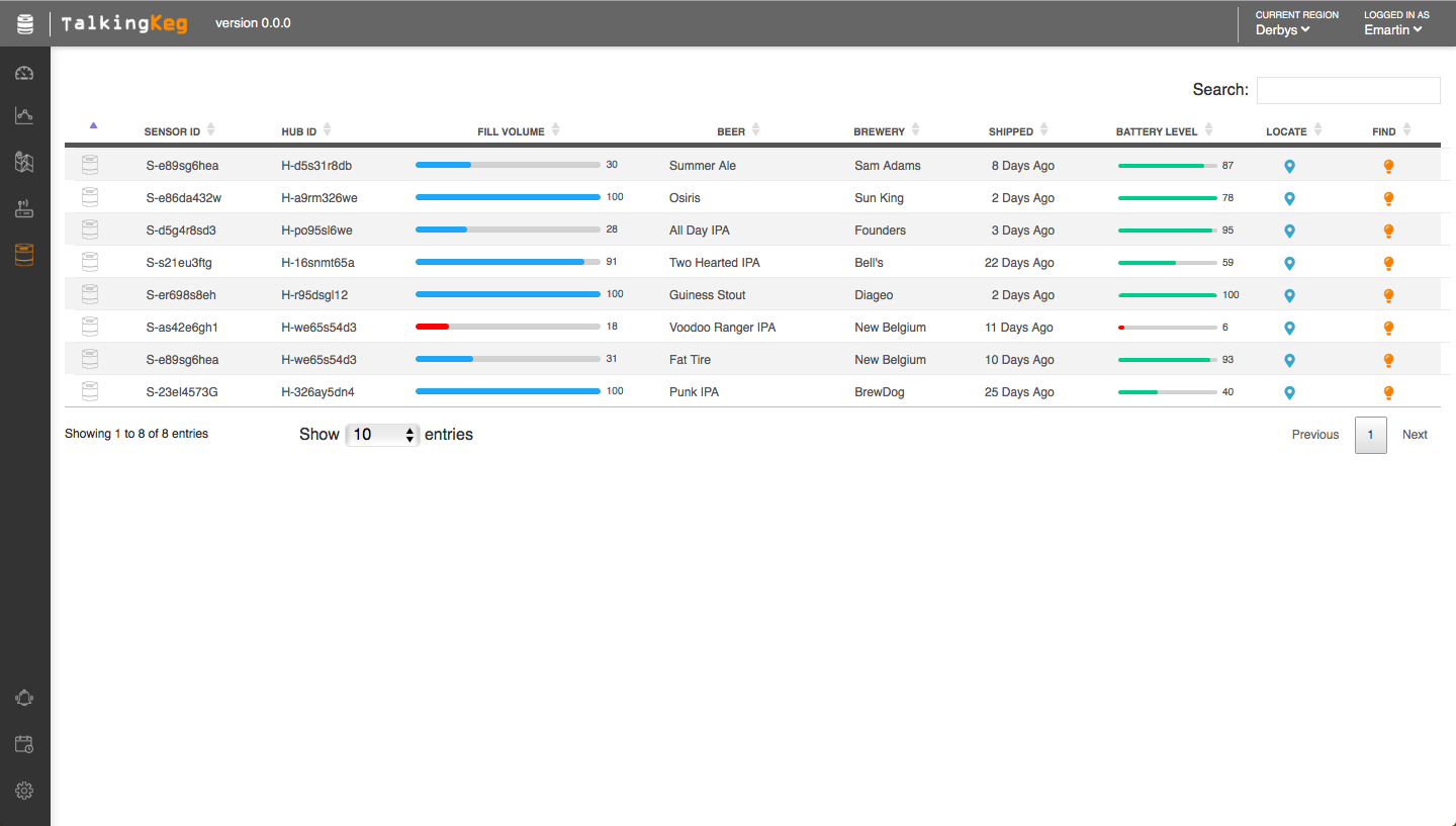
Keg Table
I was particularly happy with the heat map section of the site. I used the map box and leaflet js packages; this is always a reliable way to get a good looking map. I added a heat map js layer to this, with color coded markers to identify the volume remaining at that location. I was pleasantly surprised that I was able to find a geo JSON package that included coordinates for all of the counties in the United Kingdom! As you may imagine, this was a big file! With a couple of conversions, I was able to overlay this on the map, making the map clickable by county.
If I could do one thing over again, it would be the statistics page. I think the charts are good, but the layout is bland. Two charts in every row, all the way down the page. This could have used some more thought.


